




Jiu Flow
Jiu Flow

Uppercase Letters with Diacritics
Lowercase Letters with Diacritics
Lowercase Letters with Diacritics
Uppercase Letters with Diacritics
Uppercase Letters with Diacritics
Lowercase Letters with Diacritics
Lowercase Letters with Diacritics





Project Information
Brazilian Jiu-Jitsu is a multifaceted practice—one that moves between the stillness of strategy and the physicality of strength. It is a constant exchange, where technique, timing, and interaction open up endless possibilities. Yet to many, Jiu-Jitsu is still perceived primarily through the lens of competition: intense, physical, and high-impact.
Jiu & Café approaches the practice from a different perspective. Rather than focusing solely on competition or self-defense, the brand creates space for strategy, technical exchange, and human connection. It is a place where Jiu-Jitsu extends beyond the mat and becomes part of a broader lifestyle.
The direction was clear: to build a brand around a Jiu-Jitsu lifestyle.
Rather than limiting the narrative to the history and traditions of Jiu-Jitsu, the identity looks to Brazil itself. The Brazilian in Brazilian Jiu-Jitsu became a starting point for exploring brasilidade—bringing the culture, warmth, and everyday rituals of Brazil into the brand. From this came the central idea: Jiu-Jitsu × Cafezinho.
Cafezinho is more than coffee. It is a small ritual of hospitality and connection embedded in everyday Brazilian life. This spirit became a natural extension of Jiu & Café’s philosophy: creating a relaxed and welcoming community, where people can connect through conversation, practice, and shared experiences.
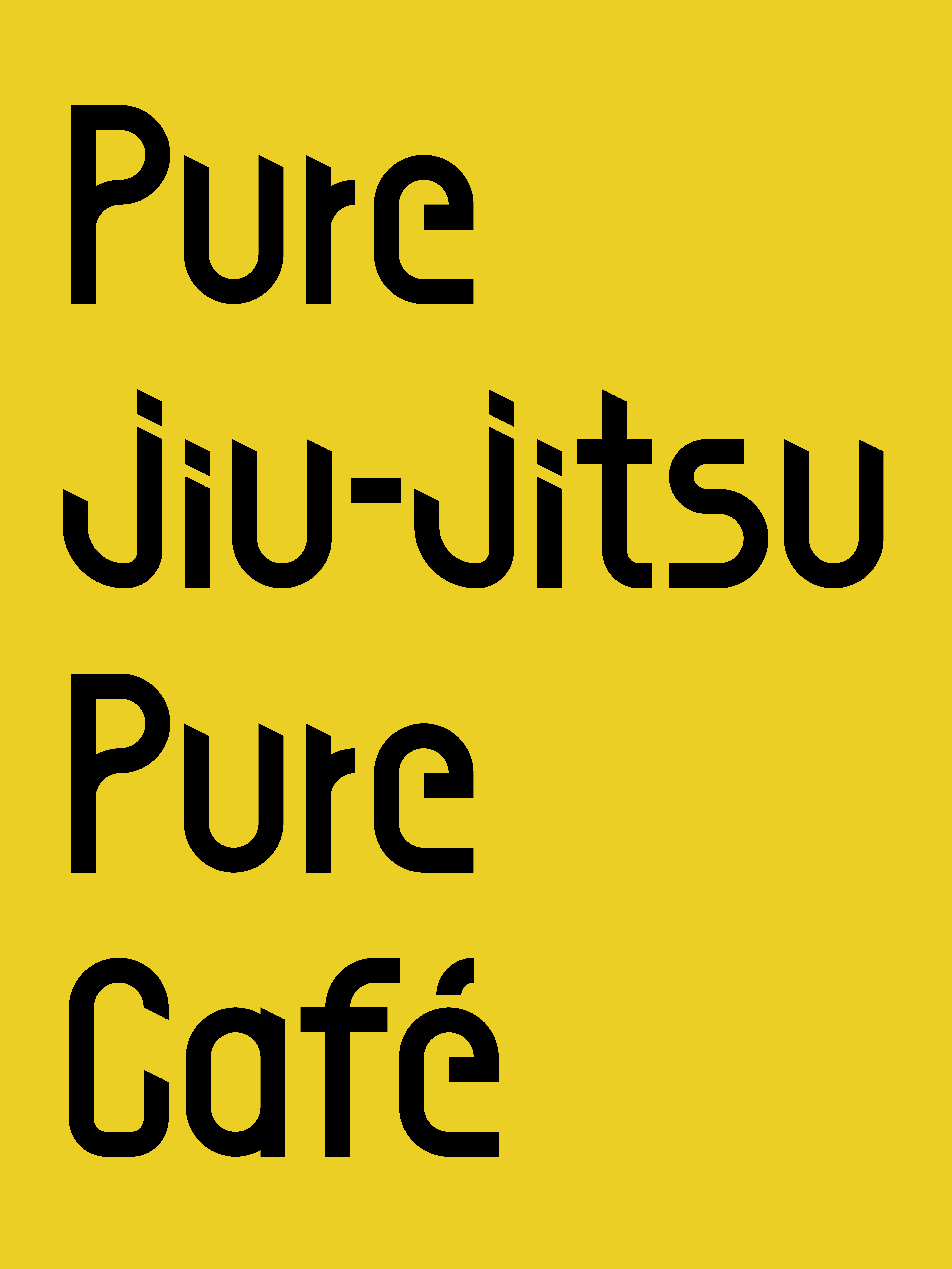
At the core of the identity is JiuFlow, a custom typeface created specifically for Jiu & Café. Its proportions and construction draw from the belt used to secure the Gi, translating the physical gesture of wrapping into a condensed typographic form. Precise contemporary geometry reflects the accuracy and control inherent to Jiu-Jitsu technique.
Designed with accented characters as part of the system, JiuFlow maintains a consistent visual language across Portuguese and other languages that require diacritics. A secondary typeface, Sofia Pro Comp, provides a clean and highly legible sans serif for longer-form communication. Together, the type system balances function and personality.
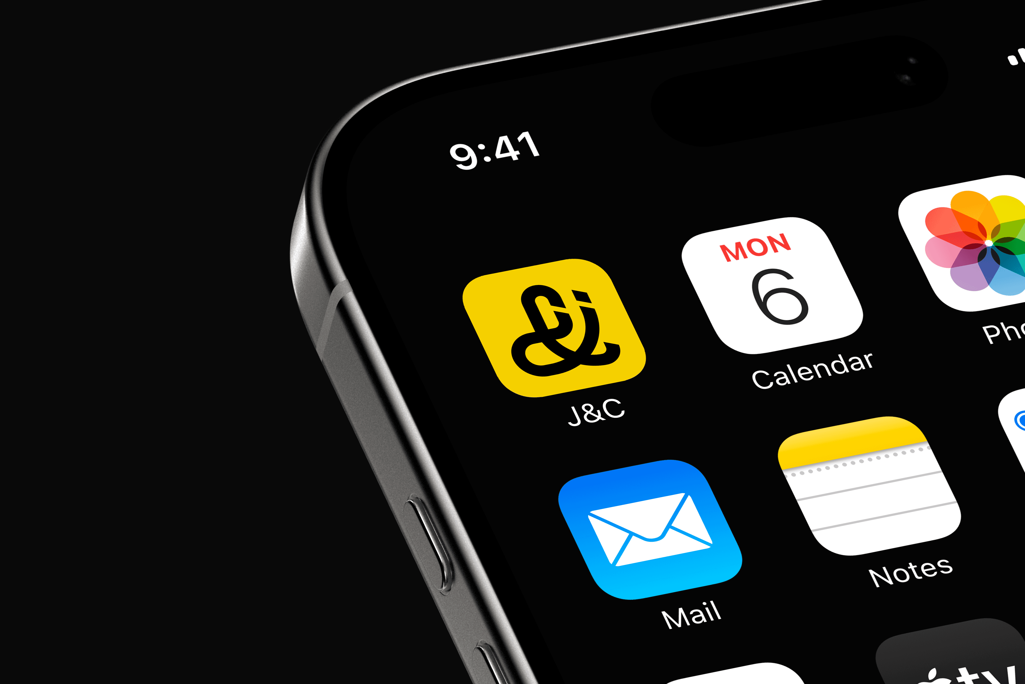
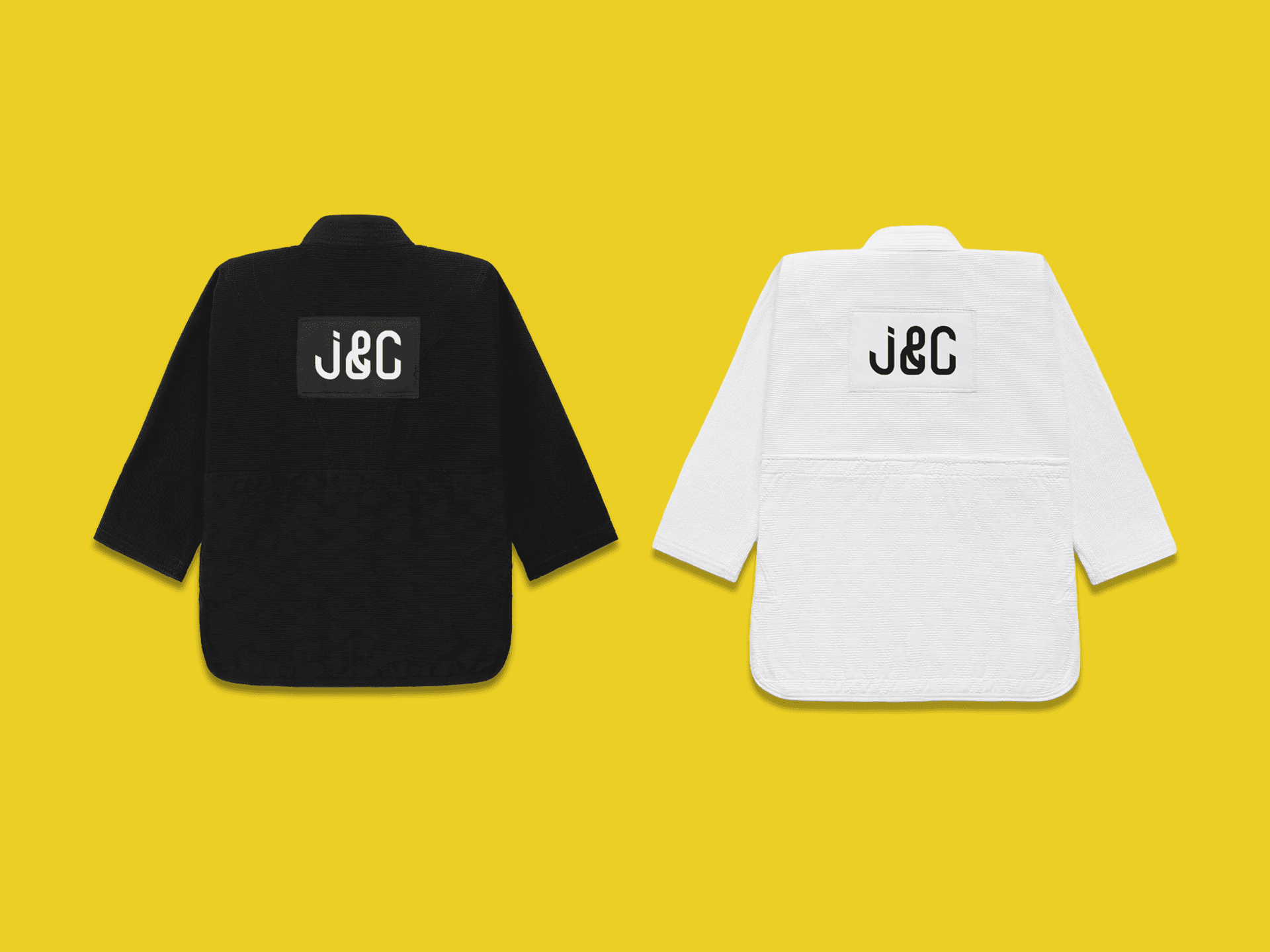
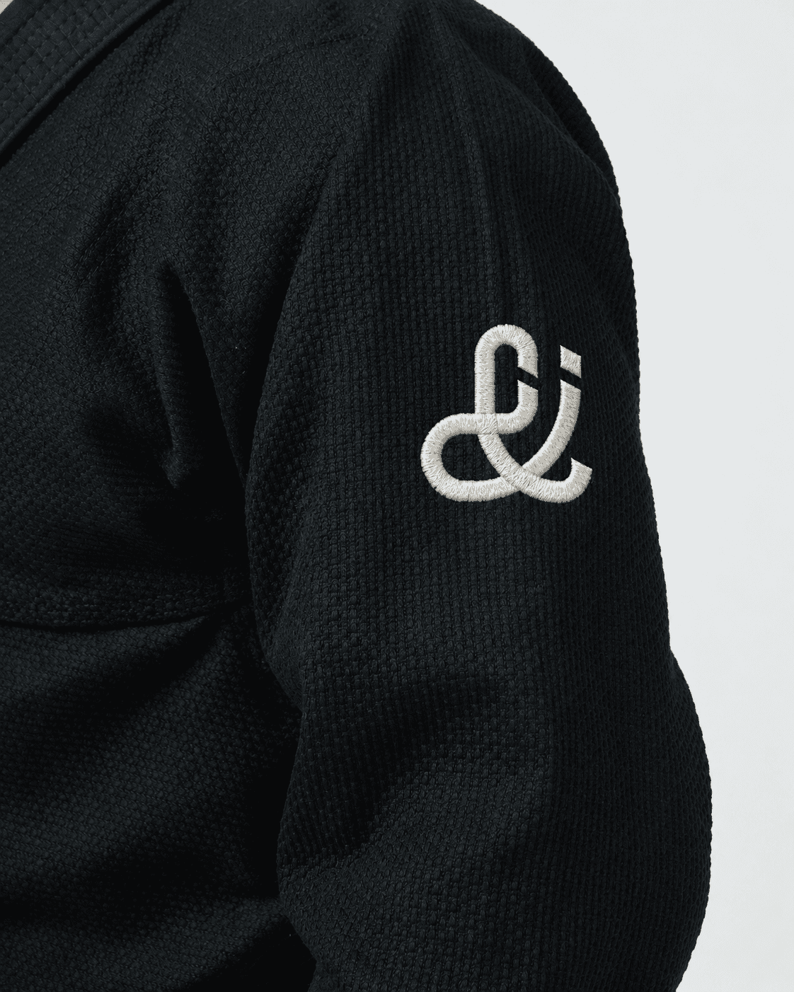
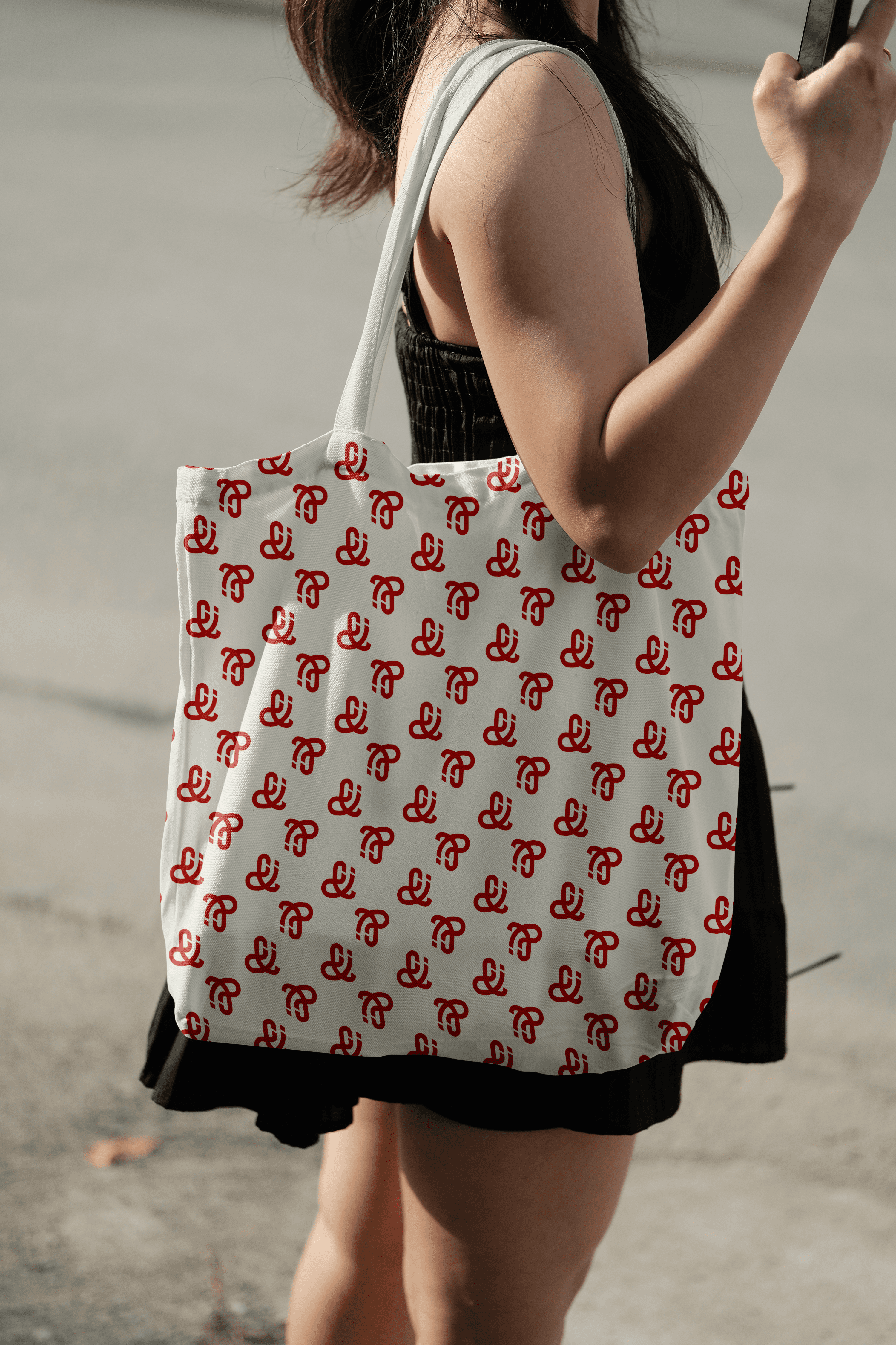
The wordmark is constructed entirely from JiuFlow. The brandmark takes this typographic language further, using precise geometric construction and JiuFlow’s distinctive angled cuts to create a symbol that simultaneously evokes the letters J and C, while incorporating the & as a central element. The result is a mark that is concise, recognizable, and distinctly Jiu & Café.
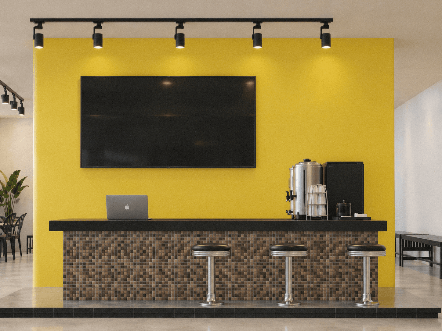
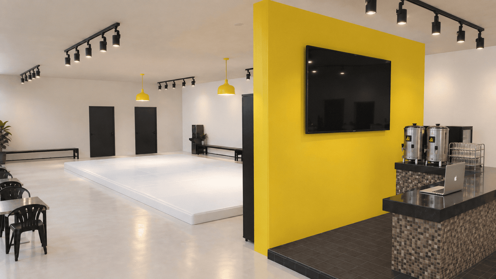
A vibrant yellow anchors the color system, bringing a sense of energy and playfulness to the brand. Yellow, black, white, and brown form the primary palette, while neutral and secondary colors introduce greater flexibility across different applications. The system can shift between quieter and more dynamic compositions, allowing each combination to reflect the balance between stillness and movement found in Jiu-Jitsu.
Simple lines and an adaptable color system give Jiu & Café a warm and approachable character—offering a different way to experience Jiu-Jitsu, not only as a sport, but as a practice of strategy, exchange, and connection.
Project Information
Brazilian Jiu-Jitsu is a multifaceted practice—one that moves between the stillness of strategy and the physicality of strength. It is a constant exchange, where technique, timing, and interaction open up endless possibilities. Yet to many, Jiu-Jitsu is still perceived primarily through the lens of competition: intense, physical, and high-impact.
Jiu & Café approaches the practice from a different perspective. Rather than focusing solely on competition or self-defense, the brand creates space for strategy, technical exchange, and human connection. It is a place where Jiu-Jitsu extends beyond the mat and becomes part of a broader lifestyle.
The direction was clear: to build a brand around a Jiu-Jitsu lifestyle.
Rather than limiting the narrative to the history and traditions of Jiu-Jitsu, the identity looks to Brazil itself. The Brazilian in Brazilian Jiu-Jitsu became a starting point for exploring brasilidade—bringing the culture, warmth, and everyday rituals of Brazil into the brand. From this came the central idea: Jiu-Jitsu × Cafezinho.
Cafezinho is more than coffee. It is a small ritual of hospitality and connection embedded in everyday Brazilian life. This spirit became a natural extension of Jiu & Café’s philosophy: creating a relaxed and welcoming community, where people can connect through conversation, practice, and shared experiences.
At the core of the identity is JiuFlow, a custom typeface created specifically for Jiu & Café. Its proportions and construction draw from the belt used to secure the Gi, translating the physical gesture of wrapping into a condensed typographic form. Precise contemporary geometry reflects the accuracy and control inherent to Jiu-Jitsu technique.
Designed with accented characters as part of the system, JiuFlow maintains a consistent visual language across Portuguese and other languages that require diacritics. A secondary typeface, Sofia Pro Comp, provides a clean and highly legible sans serif for longer-form communication. Together, the type system balances function and personality.
The wordmark is constructed entirely from JiuFlow. The brandmark takes this typographic language further, using precise geometric construction and JiuFlow’s distinctive angled cuts to create a symbol that simultaneously evokes the letters J and C, while incorporating the & as a central element. The result is a mark that is concise, recognizable, and distinctly Jiu & Café.
A vibrant yellow anchors the color system, bringing a sense of energy and playfulness to the brand. Yellow, black, white, and brown form the primary palette, while neutral and secondary colors introduce greater flexibility across different applications. The system can shift between quieter and more dynamic compositions, allowing each combination to reflect the balance between stillness and movement found in Jiu-Jitsu.
Simple lines and an adaptable color system give Jiu & Café a warm and approachable character—offering a different way to experience Jiu-Jitsu, not only as a sport, but as a practice of strategy, exchange, and connection.
Project Information
Brazilian Jiu-Jitsu is a multifaceted practice—one that moves between the stillness of strategy and the physicality of strength. It is a constant exchange, where technique, timing, and interaction open up endless possibilities. Yet to many, Jiu-Jitsu is still perceived primarily through the lens of competition: intense, physical, and high-impact.
Jiu & Café approaches the practice from a different perspective. Rather than focusing solely on competition or self-defense, the brand creates space for strategy, technical exchange, and human connection. It is a place where Jiu-Jitsu extends beyond the mat and becomes part of a broader lifestyle.
The direction was clear: to build a brand around a Jiu-Jitsu lifestyle.
Rather than limiting the narrative to the history and traditions of Jiu-Jitsu, the identity looks to Brazil itself. The Brazilian in Brazilian Jiu-Jitsu became a starting point for exploring brasilidade—bringing the culture, warmth, and everyday rituals of Brazil into the brand. From this came the central idea: Jiu-Jitsu × Cafezinho.
Cafezinho is more than coffee. It is a small ritual of hospitality and connection embedded in everyday Brazilian life. This spirit became a natural extension of Jiu & Café’s philosophy: creating a relaxed and welcoming community, where people can connect through conversation, practice, and shared experiences.
At the core of the identity is JiuFlow, a custom typeface created specifically for Jiu & Café. Its proportions and construction draw from the belt used to secure the Gi, translating the physical gesture of wrapping into a condensed typographic form. Precise contemporary geometry reflects the accuracy and control inherent to Jiu-Jitsu technique.
Designed with accented characters as part of the system, JiuFlow maintains a consistent visual language across Portuguese and other languages that require diacritics. A secondary typeface, Sofia Pro Comp, provides a clean and highly legible sans serif for longer-form communication. Together, the type system balances function and personality.
The wordmark is constructed entirely from JiuFlow. The brandmark takes this typographic language further, using precise geometric construction and JiuFlow’s distinctive angled cuts to create a symbol that simultaneously evokes the letters J and C, while incorporating the & as a central element. The result is a mark that is concise, recognizable, and distinctly Jiu & Café.
A vibrant yellow anchors the color system, bringing a sense of energy and playfulness to the brand. Yellow, black, white, and brown form the primary palette, while neutral and secondary colors introduce greater flexibility across different applications. The system can shift between quieter and more dynamic compositions, allowing each combination to reflect the balance between stillness and movement found in Jiu-Jitsu.
Simple lines and an adaptable color system give Jiu & Café a warm and approachable character—offering a different way to experience Jiu-Jitsu, not only as a sport, but as a practice of strategy, exchange, and connection.
Brand identity by Ivan Wu
Brand identity by Ivan Wu
Brand identity by Ivan Wu
Primary Logo-horizontal
Primary Logo-horizontal
Primary Logo-vertical
Primary Logo-vertical
Monogram
Monogram
Brandmark
Brandmark